Till recently our documentation had a mix of visual styles for diagrams - mixing icons from Cisco, AWS etc - I recently wanted to document the supported network topologies and realised I need a more unified visual style for the documentation.
For some time now I am using diagrams.net to generate diagrams for blog posts and such, this tool is ok for diagrams but what really sets it apart for me is that even when exporting a PNG file it can embed the diagram vector source in the resulting PNG image.
This means any image on the website can simply be loaded and edited as a vector in the diagram editor, this is huge for ease of maintenance of the website, docs etc.
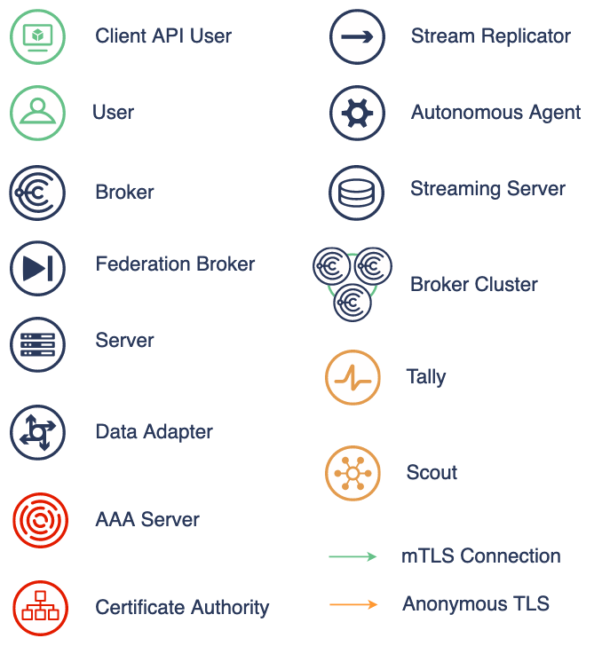
After some googling I found the Affinity symbol set - a public domain icon set in SVG format. Using these I came up with set of on-brand colored icons for our various components you can see below.
See the full post for links to assets and libraries for diagrams.net.
Various diagrams in documentation and blog posts have been updated with the new style, I also am making all the colored icons and so forth available here. These can be loaded into diagrams.net using its File -> Open Library From option.:
| File | Description |
|---|---|
| component-shapes.xml | The main components as per above preview |
| blue-shapes.xml | Component and other shapes in Choria logo dark blue |
| green-shapes.xml | Component and other shapes in Choria logo green |
| orange-shapes.xml | Component and other shapes in Scout logo orange |
| red-shapes.xml | Component and other shapes in red |
| gray-shapes.xml | Component and other shapes in light gray |
The text color is dark blue #2A395B, green line is #66C188 and orange line is #FF9933.
Hopefully Choria users and contributors will find making these guidelines and files available useful in producing content for your own internal uses that match the stylings of our documentation.